top of page

Nayantara Mukherjee
The Girl behind the Lens

VAN Design Studio, Socorro, Goa
Creating spaces which tell stories of the people living in them.
Visual Identity/ Pocket Book/ Website

They make stories that tell stories
Every space is defined by the people who live in it- in the way a wall feels, the way floor sounds, the way light enters and the way objects interacts. Bricks and metals, glass and wood are all just materials individually. But when used to create spaces, they can bring a story to life.
What was our inspiration?
Have you observed the way, posters are designed, with a primary headline, followed by important taglines or quotes? That was our inspiration. What made it more plausible was that our client wanted us to incorporate Hindi and Urdu as a part of the design system. Which is why we designed it in such a manner that the primary type of VAN can be used interchangeably beteen English, Hindi and Urdu. We identified this style in old movies and posters, since our target was ‘TELLING STORIES”- and what better source than movies.


The Heart of the Design
The logo was already thought of and executed by my industry mentors -Shefali Ahir and Deepak Jage. It was my job, to execute what they had envisioned- the visual identity and extend the brand forward. This included illustrations, Website design, Pocket Book and collaterals. The best part about this project is that, we are actually going to build a VAN- the name, the concept from where this architecture studio started. It has four specialisations, namely architecture, interior design, landscape design and product design.
Brand Illustrations
Website Concept
Pocket Book
Collaterals

What's behind my lens?
I was given a few visual references which was approved by the client and asked to replicate it, to understand the style better. I did that using gouache and watercolour. After cracking that, I was asked to visualise the same style from photographs of the structure they had build. Eventually I executed the illustration digitally on procreate, using the stynx brush.


Stage 1- Tried replicating these references to get a better idea of the visuals which the clients had in mind

Stage 2- Tried gouache for the manual style. They were not working for the collaterals
Does the brand truly echo?
Not exactly. The client really appreciated the illustration. But after making collaterals with these illustrations, he wanted finesse rather than the manual feel.


Final 'final approval'
After getting the first 'final approval' rejected after incorporating my illustrations in collaterals the client wanted finesse and textures. So I executed them digitally.


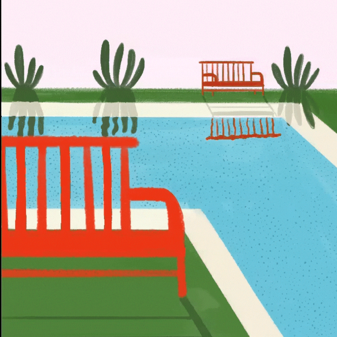
Final Illustration Style
Hue Evolution
While exploring illustrations and layouts, for the pocket book, one colour combination seemed very unique- green and light pink . Besides, green is a tough colour to own, particularly in the field of architecture where black and white have been used mainly. The style of VAN studios believes in the organic use of material, which is why this colour combination made more sense and we decided to take it forward.


The brand finally echoes
The client wanted a manual idea for the merchandise (business cards, letterheads etc.). I pitched them the idea of doing it with linocut. Eventhough it was not executed during my internship, the concept was approved.


bottom of page